Organising the Archive
-
@notsure Work laptop, completely isolated from everything including work since I don't have the VPN hooked up.
I use the laptop as a little sandbox that I reformat every now and then when it gets a little funky :)Back to adding more links to the homepage. Dropped off at 4am
last night...this morning? Oh dear more energy drinks needed. -
@lia said in Organising the Archive:
I use the laptop as a little sandbox that I reformat every now and then when it gets a little funky :)
vm. containerize. proxy. time-gated, off-site backups. @biell !!!
-
So going through these posts I'm seeing a ton of amazing pics that unless you actually go digging through threads most will never see. like look at this one from DreamTour in the "Your Pint Shipping Date".

Anyone think it might be a cool idea to have a gallery page on the archive that carousels some random pics while also giving access to a gallery of pics ranging in time uploaded?
-
@lia I added two fixes here: https://drive.google.com/file/d/1FFmb1LVADMPUvIMumuJdX50xRmqIq7iM/view
I assume Strawberry perl is having trouble with the zero-width look-behind, so I removed it and replaced it with a slightly less efficient construct.
I am also assuming that Strawberry perl doesn't have a proper POSIX::strftime (Windows isn't POSIX compliant, so this wouldn't be surprising). I just added my own little function to do the same thing for this specific instance:
my(@MONTH)=qw(
     January February March April May June July
     August September October November December
);
sub utctime {
     my($epoch)=int($_[0]/1000);
     my($sec, $min, $hr, $day, $month, $year, $wd, $jd, $dst)=gmtime($epoch);

     return(sprintf("%d %s %d, %02d:%02d UTC",
          $day, $MONTH[$month], $year+1900, $hr, $min));
}
You should be able to just rerun this version and it will overwrite the old files with fixed ones. Topic 22 had examples of the messed up avatar.
Also, LET'S GO, SPURS!!!
-
@biell Amazing, it worked :D Thank you so much!
I can't seem to get the favicon to work for some reason.
Tried to strip out thetype="image/x-icon"from the below but that seems to cause the favicon section to then pull extra text and break.s|(<link rel="icon" type="image/x-icon" href=").*?">|$1$META{'resources'}/favicon.ico">|mg;Spent an hour trying to figure it out but I'm no good with interpreting code lol.
Currently the end result is the following line:
<link rel="icon" type="image/x-icon" href="../../../assets/resources/favicon.ico">
Could it be tweaked to instead generate:
<link rel="icon" href="../../../assets/resources/OWForumArchiveIcon.png"> -
-
@lia So, that was my bad. I was downloading to
assets/resources, but looking for it inassets/system/uploads:(Updated now so that the
METAconfig at the top points to the location you want for'icon'. This way you can change it in the future if you want to, e.g. put it in/Imageswith OWForumArchive.png.https://drive.google.com/file/d/1FFmb1LVADMPUvIMumuJdX50xRmqIq7iM/view
-
@biell Ah found the issue, there's something in the topmost tags that's busting the favicon.
Surrounding the top <style> tag is some <body> and <head> which although don't mention an icon I think they're causing the browser to ignore the tag later. Used topic 20 to test as an example below.
Starts with a <html> tag that we can keep
<!DOCTYPE html>
<html lang="en-US" data-dir="ltr" style="direction: ltr;" class="nprogress-busy">
Then the element that seems to break it starts.
<head><meta http-equiv="Content-Type" content="text/html; charset=UTF-8"><!--<base href="https://archive.owforum.co.uk/topic/20/france-onewheel-riders/990?page=110&lang=en-US">--><base href=".">In between is a style tag that we need to keep as removing this bit actually breaks some elements.
<style>body{margin-left:0;margin-right:0;margin-top:0}#bN015htcoyT__google-cache-hdr{background:#f8f9fa;font:13px arial,sans-serif;text-align:left;color:#202124;border:0;margin:0;border-bottom:1px solid #dadce0;line-height:16px;padding:16px 28px 24px 28px}#bN015htcoyT__google-cache-hdr *{display:inline;font:inherit;text-align:inherit;color:inherit;line-height:inherit;background:none;border:0;margin:0;padding:0;letter-spacing:0}#bN015htcoyT__google-cache-hdr a{text-decoration:none;color:#1a0dab}#bN015htcoyT__google-cache-hdr a:hover{text-decoration:underline}#bN015htcoyT__google-cache-hdr a:visited{color:#4b11a8}#bN015htcoyT__google-cache-hdr div{display:block;margin-top:4px}#bN015htcoyT__google-cache-hdr b{font-weight:bold;display:inline-block;direction:ltr}</style>Then a closing section to the earlier <head> and <body> which needs removing.
</head><body class="page-topic page-topic-20 page-topic-france-onewheel-riders page-topic-category-2 page-topic-category-general-discussion parent-category-2 page-status-200 user-guest skin-noskin">I've "repaired" topic 20 is you want to take a peak
https://archive.owforum.co.uk/topic/20/france-onewheel-riders/index.html -
@lia Sorry, I didn't realize all that junk was up there. Firefox was honoring a lot of that meta content outside of HEAD, which it shouldn't have, so I didn't notice it. The latest version with a fix (same google drive link) is updated and ready.
Are you sure that
<style>...</style>section is necessary, what did it break? I tried wiping all of it out and couldn't find any issues. -
@lia I also just uploaded a version where the dates are no longer "permalink" items to post links which don't exist.
-
@biell If I inspect the page with F12 and remove the style a few errors show up so presumably that section is referenced. Probably not worth trying to find and remove the references so I think keeping that small <style> section will be fine.
-
@lia I removed the post hamburger menu and made the upvote/downvote chevrons no longer links (if you clicked on any them the do nothing except take you to the top of the page).
Also, in doing that, I noticed that sometimes the timestamp is to the left because different posts have different HTML layouts. So, I fixed that too.
Same google drive link.
-
@biell That's amazing thank you!
I noticed that sometimes the timestamp is to the left because different posts have different HTML layouts. So, I fixed that too
I did notice this but felt it wasn't worth bothering you over. Really appreciate you going out of your way to fix that. I assume that's from the pages that didn't get saved normally.
Currently re-running the script and preparing to replace the live data after.Finished and swapped out to the new data, looks good!!!Just got to make my way though adding the links. So many that I might paginate the homepage a little. Anyone finding any issues with load times or overall experience so far using the archive?
-
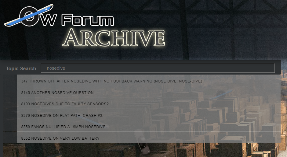
@lia For the main page, I feel like it should have a filter so you can type in something and search for topics. If you are interested, I did a mock-up here:
https://drive.google.com/file/d/1KCtjxqxqH3dJZPpe7QhAcb4v0qUWGS6c/view
I just threw this together in a few minutes, so the input box is literally just thrown on there in some semi-reasonable place. Essentially, as you type, it goes through the list items and changes anything which doesn't match to "display: none" and anything which does match to "display: block".
You can ignore the
<base>tag, as I just needed that to make my copy work. Then, I have a new<style>which should be moved to your style.css, and a<script>which can stay there or go into it's own file. After that, I added anidto your<ul>element so I could find it, and put the<input>element on the page to type into. -
@biell You're a genius. I completely wrote off the idea of a search because I had no idea how to begin with one.
I'll give that a spin when I get back home, thank you for making that!
-
@lia That is more of a filter, just for topics. If you want a full search, I would rely on google once they have fully indexed it:
https://www.google.com/search?as_sitesearch=archive.owforum.co.uk&as_q=battery
-
@biell I love it, works great and makes that list a lot less intimidating :D
Implemented the search and styled it up, maybe the one bit of coding I can do somewhat competently ;)

Edit :
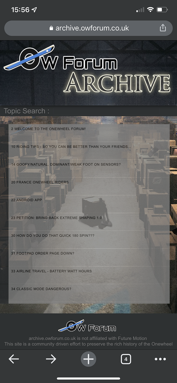
Also mobile version made so it's not a nightmare to use.

-
@lia Nice, it looks good. On Firefox, the input bar sticks out right, out past the dark gray backdrop. It looks great in Chromium.
-
@lia Also, Pro tip. It is a regular expression search, so you can type in something like this
helmet|pads|ppeand get all the results which match any of those words. -
@biell said in Organising the Archive:
On Firefox, the input bar sticks out right
Weird, on mine it sits in place. Typical firefox lol.
I'll look at trying to make it bound to the div so it doesn't zoom outside it.Good suggestion with the search, I'll see if I can figure that out :)